Noumenon — Poster Design, after Immanuel Kant

ASM KAWSAR/ MA Coursework / Noumenon
MA Coursework · Aesthetics of Graphic Design

NOUMENON

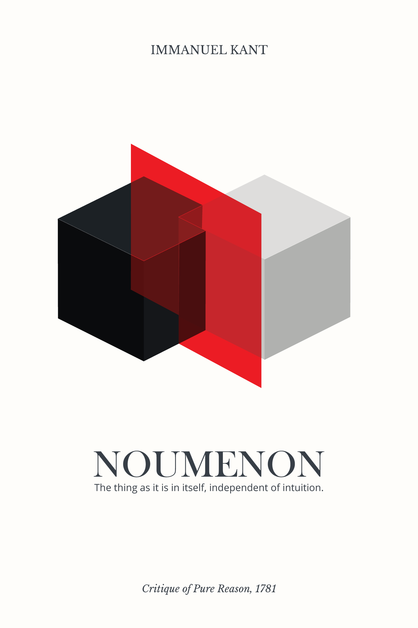
An aesthetic poster design after Immanuel Kant’s Critique of Pure Reason (1781) — using layered, semi-transparent geometry rather than illustration to explore the idea of the “thing-in-itself,” the noumenon that exists beyond human perception.

Course
Aesthetics of Graphic Design
Instructor
Professor Md. Maksudur Rahman
Format
Aesthetic Poster Design
Reference
Immanuel Kant, Critique of Pure Reason (1781)
System
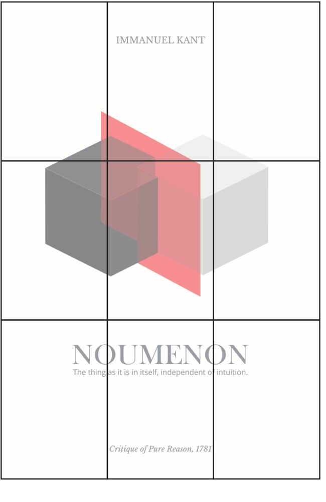
3×3 Modular Grid
Year
2025

Project Overview

This poster interprets the philosophical idea of the “noumenon,” introduced by Immanuel Kant in Critique of Pure Reason — the concept of a “thing-in-itself” that exists beyond human perception.

Rather than illustrating the idea directly, the design explores it through spatial obstruction and layered geometry. Intersecting volumes partially conceal one another, suggesting that what we see is always limited by perspective. Transparency and overlap represent the boundaries between visibility and concealment.

“The thing as it is in itself, independent of intuition.”
Immanuel Kant — Critique of Pure Reason, 1781

The restrained color palette supports conceptual clarity. A single red plane acts as a visual interruption — marking a threshold between what appears accessible and what remains unknown.

Design Thinking

Visual & Structural Approach

Grid, Type & Negative Space

The composition is built on a controlled modular grid system (3×3), ensuring proportional balance and structural alignment. Typography is minimal and intentionally restrained — a serif typeface references classical rationalism while maintaining contemporary clarity.

Negative space plays a central role in the design. Large empty fields function as visual silence, reinforcing the idea that absence can carry meaning as strongly as form. Through geometric reduction and spatial control, the poster investigates how perception is structured — not only by what is shown, but by what is withheld.
Iterative Testing
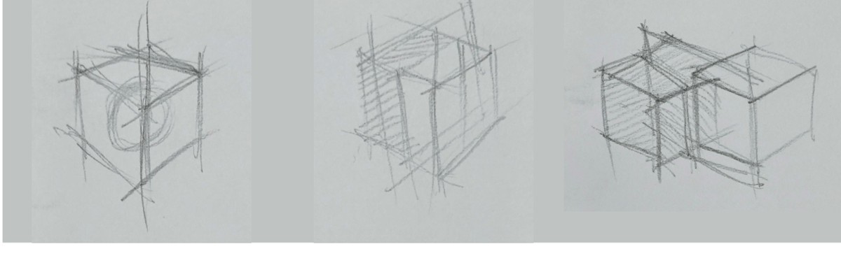
The final composition emerged through iterative testing: volume and depth studies, alignment adjustments within a modular grid, transparency layering experiments, and color reduction toward minimal contrast — each step focused on reducing visual noise and strengthening conceptual clarity.


Three hand-drawn pencil sketches exploring cube volume, intersection and transparency

Initial volume explorationIntersection studyTransparency layering test

Geometric Proportion & Spatial Alignment
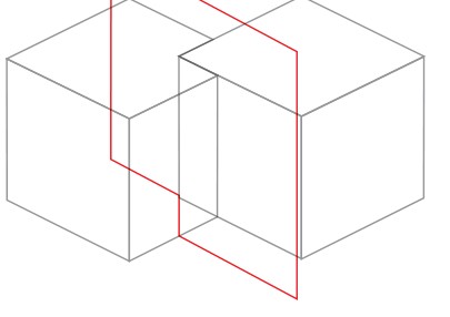
A wireframe pass isolates pure structure — the two cube volumes and the piercing plane reduced to outline, used to test proportion and spatial alignment before color and tone were reintroduced.

Color Reduction Toward Conceptual Clarity
Cyan, red and yellow variants were tested for the piercing plane before red was chosen — the most direct visual interruption, and the clearest marker of a threshold between the visible and the unknown.


Three color variants of the poster mark — cyan, red and yellow planes — tested side by side

Course Instructor
Professor Md. Maksudur Rahman

Md. Maksudur Rahman
(Professor)
Department of Graphic Design
Dhaka University
maksudrahman@du.ac.bd  ·  01715244322

(0)